Saturday, September 30, 2006

The Trails of Shazam #2 - A Review


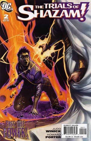
The Trail of Shazam #2 - Writer Judd Winick, Art - Howard Porter

Premise - Magic has changed and the Marvel family is no more. Billy Batson has become a replacement for the Wizard and a new guardian will be needed. Freddy Freeman (the former Captain Marvel Jr.) has to pass a test from each of the gods of magic to earn the power this time and become Shazam.

What I Liked:
1) The premise and the direction the book is heading. I love when we actually have change and try to move characters forward (see all my prior diatribes about aging Bruce and making Dick Grayson Batman). I know that DC has tried to make Captain Marvel work many times, but the innocence of the character does not work as a long term character in the structure of today's comic market place. This does not mean I can't wait for Jeff Smith's Captain Marvel - because I can't - I want that series now. Just because we move a concept forward, doesn't mean we can't do mini-series or special stories of older times. BUT - now we are taking a character forward. Billy Batson has been transformed in a combination Captain Marvel and the Wizard. Freddy Freeman is now tasked with earning the power to become Shazam. A new generation is taking over. I love it. I have been following comics for years and I welcome new generations all the time. It brings in a clean slate for new stories to be done, while honoring the heritage of what has gone before.
2) The character building bits with Freddy Freeman. A nice introduction to our hero and it we learn a fair amount in a short period of time.
3) The art. Howard Porter is learning a new style and method to doing his art. It appears to be heavily computer generated and is apparently being colored by Howard also. It was a dramatic departure from his old style and he has already gotten better from issue #1 to #2, but it is just okay at this point.

What I Didn't Like:
1) The art. I know, I said I liked it, but I'm iffy on the art in this book. I appreciate the effort that Howard Porter is putting into it and if I was betting I would guess by issue #6 the art maybe great, but I feel like we are learning with Howard Porter how to make this style work in comics as he does.
2) The white Captain Marvel with silver hair. I may get used to it in time, but for me the costume is a little too... something, it's not right for me at this point. I hope we explore exactly what the hell happened to poor Billy Batson down the road.
3) Mary Marvel's fate. At this point it looks grim and I would hate for a hero that I loved (especially in the last "I can't believe it's not the Justice League" series) and who came across so heroic would end up a vegetable for life.

Grade - B

Batman #657 - A Review


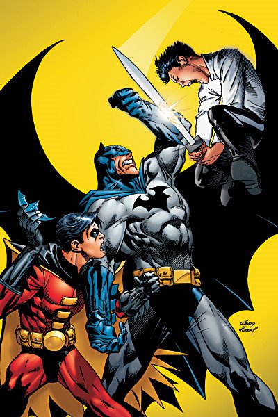
Batman #657 - Writer Grant Morrison, Artist Andy Kubert, Inker Jesse Delperdang, Colorist Dave Stewart

Premise - Part 3 of Batman & Sons - Wonderboys. Batman has taken in his supposed son from a long ago dalliance that he had with Talia. He brings Damian back to Gotham and tries to intergrate the boy into a more normal life. Damian has been trained by the League of Assassins.

What I Liked:
1) The art. Comics are strongly a visual medium and the art is the first thing that I always notice. Andy Kubert has a great style (the Kubert's are the Mannings of the comic book world) and I loved the two page Batcave spread. Between the six page spread in All Star Batman and this it appears all artists want to draw the cave. Great artwork, strong inking and great colors. Love the layouts usage, six panels, five panels, one panel, two page spread, just really well done.
2) Character bits. Morrison has done a great job of having Robin and Alfred in the book, but still keeping the focus on Batman himself.
3) The return of the Spook. A very minor villain, but a fun use of the character. Loved the undercover cop infiltrating the Spook's gang.
4) The fight scene between Robin and Damian in the Batcave.

What I Didn't Like:
1) That Batman just brings an obviously highly dangerous person into his domain and then runs off on a case.
2) That Robin was beaten by Damian in a fight. To be fair Robin was holding back and suckered by the kid, but still if felt like we lessened Robin.
3) That an apparent 10 year old (at best) kid pulled all the crap off he did in the book. I suspend my disbelief at the door of a comic, but expect some level of internal realism and this stepped over the bounds for me.

Grade - B

Side comment - since the One Year Later jump DC has put great talent against Batman and Superman and I'm glad that the two biggest and most well known heroes are being treated the right way by DC.

Daredevil #89 - A Review


Daredevil #89 - Writer - Ed Brubaker, Artist - Michael Lark & Stefano Gaudiano, Colorist - Matt Hollingsworth

Premise - Matt Murdock is under cover and hiding out from the law as he searches for the man who order Foggy Nelson killed. Matt does not know that Foggy is alive and in a witness protection program.

What I liked:
1) The art. Michael Lark and Stefano Gaudiano apparently share duties on this book and their styles mesh so well that without really studying the art I can't tell where one begins and the other ends. The art is detailed where needed and sparse when needed. Strong layouts and solid story telling skills make this book a nice book to look at every month. The colorist Matt Hollingsworth nails this book every month. It just sets the mood for the book perfectly.

2) The return and update of a really lame ass villain of Daredevil's from the silver age, the Matador.
3) The overall story arc seems compelling at this point. I like the mystery, but the ending will show if it is worth it or not.

What I Didn't Like:
1) The incoherent continuity and stupid premises we are supposed to accept. Matt does not know Foggy is alive? How can Electra being all knowing and know where Foggy is to protect him with 400 ninjas and she can not got a message to Matt? Plus the mysterious character behind the scenes needs to be revealed really soon or it just gets old.
2) The poker game. I thought I hated it because I'm a poker player and know you don't win every hand even when you are on fire, but others hated that scene also. Matt's powers allow him to make people fold or know other people's cards without even touching them. It was so outrageously dumb, it took me out of the book.
3) The damsel in distress smells like his old love Karen Paige and the villains know this? People have certain smells, but replicating this seems a little silly.

Grade - C+

Amazing Spider-Man #535 - A review

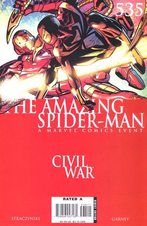
Amazing Spider-Man #535 - Writer J. Michael Straczynski, Artist Ron Garney, Inker Bill Reinhold, Colorist Matt Milla

Premise - Part Four of Six of the arc entitled "The War at Home". The series has focused on Peter Parker's personal view of the Civil War and his growing unease as to which side he has chosen to be on.

What I liked:
1) The art. Ron Garney is not my all time favorite artist, but the more I see of his art work the more I enjoy it. His work at times hovers on cartoony, but is somewhat a minimalist style in use of his lines. My description is inadequate, but what I can say is it is a great story telling style and has a nice dynamic feel to the art. Reinhold appears to be a good inker for the book and the colorist did a decent job, but I thought was a little heavy handed and too dark. I worry that many colorist have yet to take full advantage of the new technology and paper being used today.

2) The return of Peter Parker. I recognized the guy I used to love as my hero. Doing the right thing no matter what the price. He is switching sides even though his identity has been compromised and he has Mary Jane and Aunt May to protect. Spider-Man felt like he was a man again and not someone's tool. It felt as good as when Batman stopped being an asshole and returned to being Batman.
3) The end scene where Iron Man and Spider-Man start to have their fight. Just neat stuff.

What I Didn't like:
1) Tony Stark. His whole characterization is so far off any previous continuity that I don't even know who the hell I'm reading about. This guy has gone from a hero to as bad as a villain as anyone could be. If this is a balanced representation of both sides viewpoint, I'm sure interested to see a unbalanced view.
2) Reed Richards. Even worse then Tony, a totally unrecognizable character. Why is Marvel spitting on some of their core old time silver age heroes is beyond me. What utter crap. I can only hope the Dwayne McDuffie can rescue the FF out of the doldrums and crap that has been laid on their continuity.
3) The awful speech that Reed Richards makes that after his uncle is railroaded, whom he loved, it made him realize you should always follow the law. What the f*#k are they talking about. When did it make Reed realize this - one month before Civil War. Just recently he defied a government mandate in his own book with trying to remake the Fantastic Four accident. And, by the way, didn't he steal the spaceship that launched him, his best friend, his girl-friend and his girl friend's younger brother into space. Now he follows the rules - bullsh*t.

Grade - B

Friday, September 29, 2006

Supergirl #10 - A Review


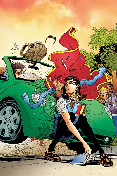
Supergirl #10 - Writer - Joe Kelly, Artist - Ian Churchill, Inker - Norm Rapmund, Colorist - Rod Reis

Premise - Supergirl is trying to find herself and what her place in this world is and decided to try going to high school in a secret identity.

What I Liked:
1) The art. Ian Churchill has been growing as an artist and his first page of Kara walking into high school was great. He is also showing a strong ability to draw various body types and has clean solid layouts. The inker is complimenting his work well and the coloring is perfect for this book.
2) The entire going back to high school was done well. It has been a long time since I was in school and I was not a young girl in high school, so how much is really true or not is beyond me, but it read very well. It had humor and heartfelt moments through out the story.
3) The homage to the Linda Lee Danvers secret identity of the silver age Supergirl was also well done and understated.
4) The ending was fantastic, Supergirl reveals herself to her classmates and walks away from her try at being in school after being humiliated by a supposed friend.
5) The interaction with Wonder Girl and Captain Boomerang Jr.

What I didn't like:
1) Supergirl talking out Monsieur Mallah with one finger. Hate the uber powered people being so superior to anyone else. Plus enough with Monsieur Mallah - DC has other villains.
2) The flashbacks to Supergirl's early life. Still confused on the whole Kandor thing and her early years.

Side comment:
I swear I don't know why I like this book so much, because I thought it lacked direction, but I think it is supposed to lack direction as that is part of what Supergirl is going through. Joe Kelly and Ian Churchill have made me a fan of this book.

Overall Grade - B+

Thursday, September 28, 2006

Comic Reviews : JLA #2 / Captain America #22

Justice League of America #2 - Writer Brad Meltzer, Artist Ed Benes, Inker Sandra Hope, Colorist Alex Sinclair

Premise - Batman, Superman & Wonder Woman are still deciding who should be in the JLA, while the apparent line up are all off on their own adventures. Black Lightning and Vixen in solo roles and Green Lantern, Arsenal & Black Canary on a group mission and finally Red Tornado hanging out at home.

What I Liked:
1)The art work is pretty. Ed Benes is a very good artist and Sandra Hope's inks seem to compliment his work. The coloring is also well done.
2) The teaming up of Green Lantern, Black Canary and Arsenal. This harkens back to the Denny O'Neil / Neal Adams hard traveling heroes days.
3) The interplay between Arsenal and Green Lantern and Black Canary. Some nice character bits.

What I Didn't Like:
1) Are all five storylines taking place at the same time? With an issue #0 we are three issues into the series and still have not started the JLA up again. The pace is very s-l-o-w.
2) Superman asking Wonder Woman yes or no on Batman behind his back. We just established that the Trinity are tight friends and comrades-in-arms and now this stab in the back by Superman. Very out of character.
3) Vixen has her Totem belt stolen by two low level bad guys. Doesn't do much in making her League material.
4) The Red Tornado & Cathy home story. I thought I was reading Young Romance for a second. Really overplayed.

Overall Grade C+

Captain America #22 - Writer: Ed Brubaker, Artist: Mike Perkins, Colorist: Frank D'Armata

Premise - Captain America's regular comic catches up with the Civil War. The spotlight is on Sharon Carter (Cap's girl-friend and Shield agent) and she is seeing a therapist to discuss why she choose Cap over duty to her job.

What I liked:
1) The art work is solid. Mike Perkins is a good story teller and has decent art. He is not a knock your socks off type guy at this point, but it is very readable and professional. The coloring is okay, a little too dark, but keeping with the tone of the book.
2) The effective use of flashbacks to bring this comic up to date with Civil War. I doubt any reader of this book hasn't been reading Civil War, but still it was a nice way of getting the book in synch without sacrificing telling a story within the context of this issue.
3) Cap and Sharon getting together and having an adult relationship. If they are in love and can only meet on a rare occasion, this made sense.

What I didn't like:
1) The paper. It's glossy, but feels so extremely thin. A minor point.
2) The story. Sharon in fact is not in love with Captain America, but the Red Skull has Faustus manipulating her. I hate this crap. Hell why not make her a LMD on top of it. She can't really be in love with Cap, so she was manipulated into it. The Red Skull (who is fighting for control of a body) has been behind her falling for Cap for how long? All of this type of stuff is a cop out to keep the hero from every having a real relationship. It's really stupid and annoying. Also Faustus just uses an image gimmick to disguise himself. Shield would have better security then that. Finally it demeans Sharon to think she could be manipulated so easily.
3) Captain America is a supporting player in his own book to allow any real events with Cap to happen in Civil War. Crap!

Overall Grade - D.

Wednesday, September 27, 2006

The $3 Dollar Whore Dilemma

I occasionally enjoy the shock headline.

The $3 dollar whore is a reference (that I first heard from Jeff) to buying the single issues of comics for $3 versus waiting for a trade paper back or a hard cover format of a story. It is amazing how many formats that comics come in now days. You can buy the single issues, buy the collected trades (usually six issues or more) at a better bargain for you dollar or buy the hard cover version. Recently we have added the mini-hard cover version.

Justice from DC is publishing the comic and has the 4 issue hard cover versions coming out, a trade is sure to follow and eventually they will do an Absolute edition on this baby.

Punisher is a monthly, they do six issue trades and they do a 12 issues deluxe (slightly over sized) hard cover version. Six issue is $18, the trade is $15 and the hard cover is $30. Why are we buying the monthly version at all.

I have three books I get as trades (Punisher, 100 Bullets and Walking Dead) and I will only buy Ultimates Volume 2 as a deluxe hard cover format as Bryan Hitch's artwork looks great in that format. I buy the monthlies but try to never buy a trade of any monthly I get, unless it is something that I absolute love and want to own. Very few books met that criteria and Aquaman might be the only one right now that I will go that route. If it is especially good and I want to own it (as I give away almost every monthly) I'll wait years if need be and get the hard cover. I skipped the trades on New Frontier holding out for the hard cover that comes out next month.

I wonder with all these formats how is a comic judged as a success anymore? Does a company consider how the trade sells as wells as the book sales? And when is it going too far. Invincible (a book I love) did the monthlies, the trades and recently did the hardcover for 12 issues worth of material. Now they are offering an Omnibus of 24 issues in another hard cover format. I got the monthlies and the 12 issue hard covers, but I ain't buying the over sized version.

Still I may get the Spider-Man Omnibus which covers stuff I have in Masterworks and I have been roped in on buying other books in multiple formats, but I try to resist 90% of it. I wonder what portion of the sales of these formats reach a new customer and how much is the same customers buying the same material in different formats?